Hey everyone!
If you follow me on Facebook or Instagram, you know that I designed my first collection for my very first fashion show which was held at the end of May. Yes….I realize it is almost August and I still haven’t posted photos!!! More on that later, but for now I can say that the wait is finally over. 😀
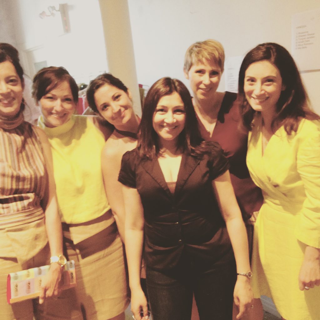
Darrell Graham, the fabulous gentleman and owner of Darrell Thomas Textiles (where I teach), was asked to host a fashion show as a fundraiser for the Mississippi Valley Textile Museum in Almonte, just outside of Ottawa. The catch? He had to get it together in less than six months!!! He decided to showcase no more than 10 local designers including himself, and of course Darrell’s standards are extremely high so we ended up with seven. I agreed around mid-February to participate, which gave me a mere 13 weeks to find my inspiration, nail down my colour story, design the pieces, draft the patterns, pick the fabrics, and create the garments. (Now that I write it all down, I realize why I was so stressed from March to May!!) Knowing that this was my first collection, and knowing that I am a slow sewer (never mind a pattern drafting newb), I decided to be realistic with a five-look collection.
I watch Project Runway religiously, but other than that I don’t have much experience with the process of designing a collection. So, I took what I knew. “Cohesion.” (Thank you, Nina Garcia.) “Who is this woman?” (Thank you, Heidi Klum.) “What is your point of view as a designer?” (Okay Zac Posen, you get a little nod as well.)
My current point of view as a designer should be pretty clear from my blog and website – I design for the career woman who wants timeless, classic clothing and who values quality over quantity. My personal aesthetic is very clean, chic and tailored – think Kate Middleton and Audrey Hepburn. With that in mind, I knew I wanted to design a late spring/early summer collection taking a slightly softer and more relaxed approach. The “woman” was also pretty clear – an Ottawa woman who has a successful career, but the clothes she would wear perhaps going for a drink after work in the Market or having a casual lunch with friends on a vacation Friday.
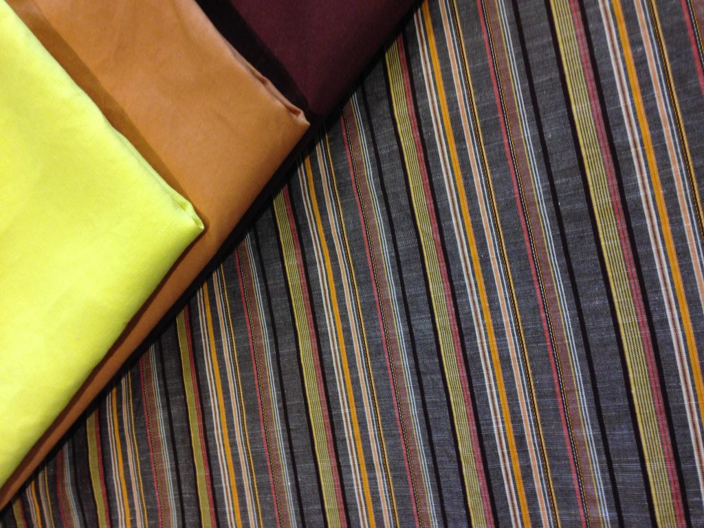
So that leaves cohesion. The Project Runway judges talk about this a lot – a collection needs to tell a story. Even if the story isn’t literal or specific, at the very least the collection must have a “feel” or a “mood”. In my case, I thought about the SheSpoke woman and what kind of pieces she would wear given her life, but also given our weather and culture in Ottawa. I knew I would also create cohesion with a few design elements that would be echoed through the collection, and finally I knew I would have a cohesive colour palette. The colour palette was actually a nice success story. Vertical stripes were big this season, and I knew I wanted to incorporate a striped fabric. I happened to have this beautiful shirting material in my stash, and I decided to pull the colours from the stripes to create my collection!
The actual designing of the looks was really interesting, because it opened up a new path on my design journey that I’m currently loving: Fashion Illustration. So – let’s talk about that!
I’ve always had an interest in art and drawing – not that I’ve always done it, but that I’ve always wanted to do it and be good at it. I did take some art classes when I was younger and I remember loving it. You know how it is…life gets busy and there is only a limited amount of time for hobbies, so this was one that fell to the wayside. However when I started sewing again a few years ago, I knew I was going to need to pick it up again at some point.
Once again, Project Runway has been a source of inspiration for me for many years. Not every designer on the show can draw well, but the ones that can are really phenomenal. One of my favourites is Michelle Lesniak; go back and look at her sketches of the collection that won her the season 11 title. Stunning. So – for my first collection, I knew that I wanted to attempt to sketch it out but I knew my drawing skills would not be good enough. And so I cheated!
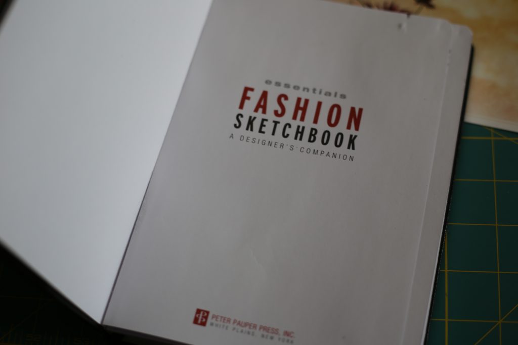
There are a number of sketchbooks out there that have pre-printed croquis templates on them. A croquis – which literally means “sketch” in French – is a quick sketch of a fashion figure with clothing. I purchased this sketchbook on Amazon for a great price. It’s small, which is great because it’s portable, and it was a good start for me to try to get my thoughts on paper. After a bunch of rough sketches of clothing and trying different sleeves, hems, etc, I finally settled on these as my “final sketches”.
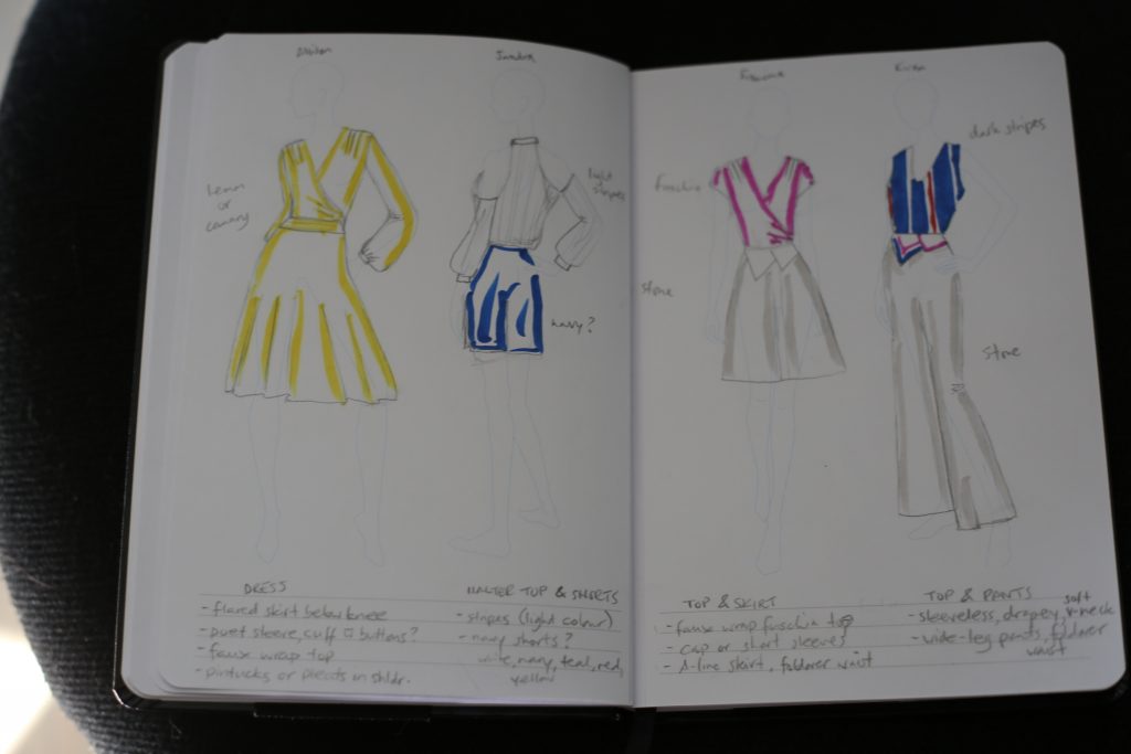
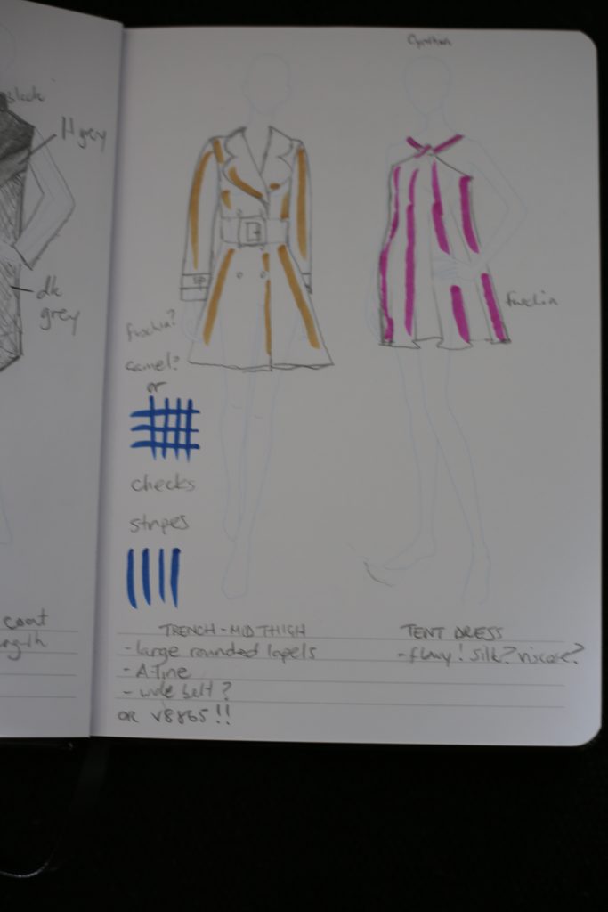
You probably can’t read all of the notes on the sketches, but they describe the design elements, fabrics, etc. At the top of the sketches are the names of my models.
The templates make it fairly easy to envision how to draw the clothes, and I made a half-assed attempt at draping (yes, there are issues with some of my drapes). The colours in the sketch were my original colour palette, but when I went to Darrell’s to buy fabric I couldn’t find fuchsia or a striped fabric with navy. The “stone” colour got replaced with khaki, and the blue got replaced with my striped fabric. The final dress which had been planned in fuchsia ended up being burgundy.
I knew I wanted to do final sketches in colour, and I know that many fashion designers use marker rather than paint or coloured pencil since it is very fast to render with marker. I was on the internet trying to find marker reviews to decide what brand to buy, and I happened to stumble upon a YouTube vlogger named Zoe Hong. The first video I watched was her Intro to Markers video, and right away I was hooked. First of all, her approach to illustration is as a fashion designer and not an artist, so she gives different advice than perhaps an artist would. Second, she is damn funny. She is direct, sarcastic, and has a dry sense of humour. She definitely had me at “hey, hey party people”. If you are at all interested in learning how to do fashion illustration for design communication, watch every single one of her videos. Zoe has taught at fashion design schools, and her YouTube approach is the same as her classroom approach which means you are getting thousands of dollars of education FOR FREE. She is completely phenomenal, and yes I’m going to try to have drinks with her when I head to California in the fall! Hopefully she thinks it’s cool and not creepy when I ask, LOL.
So – I’m working on learning her croquis building process and getting good at drawing my own croquis templates. I’m also learning how to sketch clothes and how to work with markers. In the near future I will post a new set of sketches of this summer collection that I developed based on how they actually turned out, and you can tell me if my drawing has improved!!
I did not take photos during my patternmaking and sewing phases. Sorry guys – the timeline was just too crazy and I couldn’t stop every thirty seconds to shoot. Also, I’m no expert at patternmaking so there were many errors and do-overs along the way, and I’d rather only share tutorials when I know what the hell I’m doing. However, what I will do is run down each of the looks and how they changed from first sketch to final garment. I’ll go through them in order of the sketches.
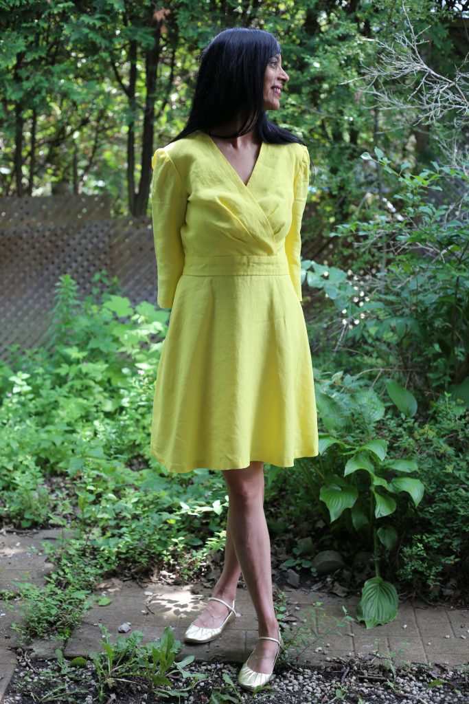
THE YELLOW DRESS: When shopping for fabric at Darrell’s, I found several fabulous linens including a yellow that almost exactly matched my sketch. Linen, although it wrinkles, is a classic summer fabric because it is so cool to wear and easy to care for. As per the sketch, I wanted this dress to have a faux-wrap top, defined waistband and flowy skirt. I had envisioned pintucks at the shoulders but dropped those from the final design mainly due to time. For the sleeves I had envisioned full-length poet sleeves, but the fabric was not as sheer as I had sketched and I felt the full sleeves would be too overwhelming. I ended up doing 3/4 sleeves with kind of a bell shape. Other than those changes, though, the dress I think turned out pretty much as I had pictured it!
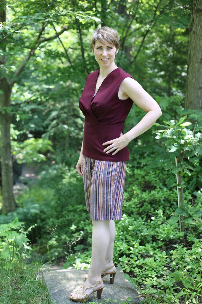
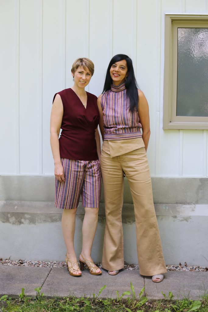
THE HALTER NECK TOP AND SHORTS: Essentially, I ended up taking the V-neck tank from the fourth sketch and swapping it with the halter neck top in the second sketch. For “cohesion” in the collection, I made the V-neck tank with a faux wrap that mimicked the one in the yellow dress. Since I eliminated blue from the collection I was originally going to do the shorts in the orange rust colour, but when I did the first fitting I realized I had sewn pumpkin shorts. The top ended up being in burgundy – I used the same satin as the cocktail dress but I reversed the fabric and used the matte side – and so I did the shorts in the striped fabric to bring it into another look and because those vertical stripes really made my model’s legs look great!
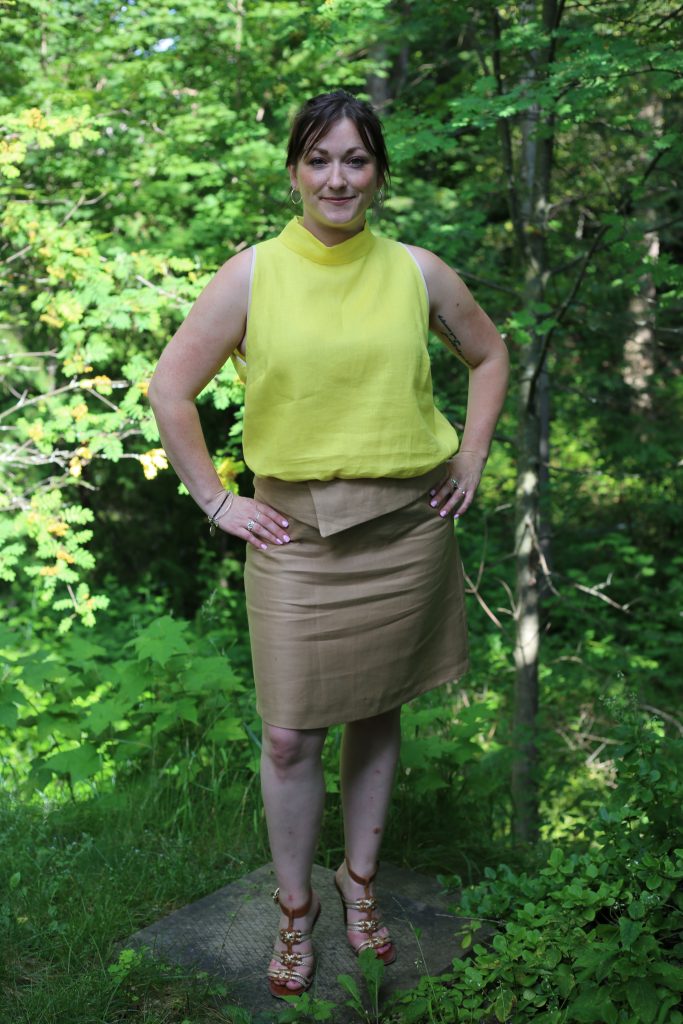
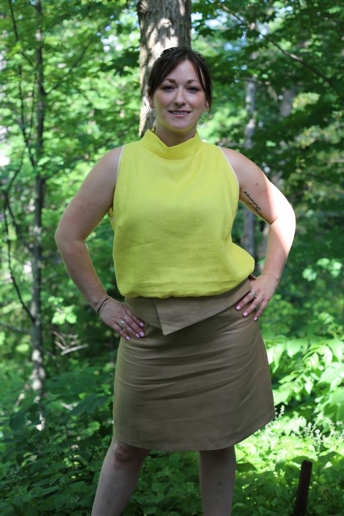
THE SHORT SLEEVED TOP AND A-LINE SKIRT: One of the first pieces I made for the collection was the striped halter top (sketch #2). It ended up looking so great that all my models wanted to wear it. When I did the first fitting with Francine, I actually did have a faux-wrap short sleeved top like the sketch but it just didn’t look awesome, so I ended up doing a halter top for her in the yellow linen. Whereas the striped halter top was fitted, I did Francine’s halter top in a more relaxed shape. The skirt ended up almost identical to the sketch, with this “foldover waist” design element. I won’t lie – I saw that foldover waist in several designers’ spring/summer collections and had to have it in mine, so I kinda borrowed the idea. However I tried to make mine different by making it in the same colour fabric and with no extra embellishment. I am pretty pleased with how this outfit looks!
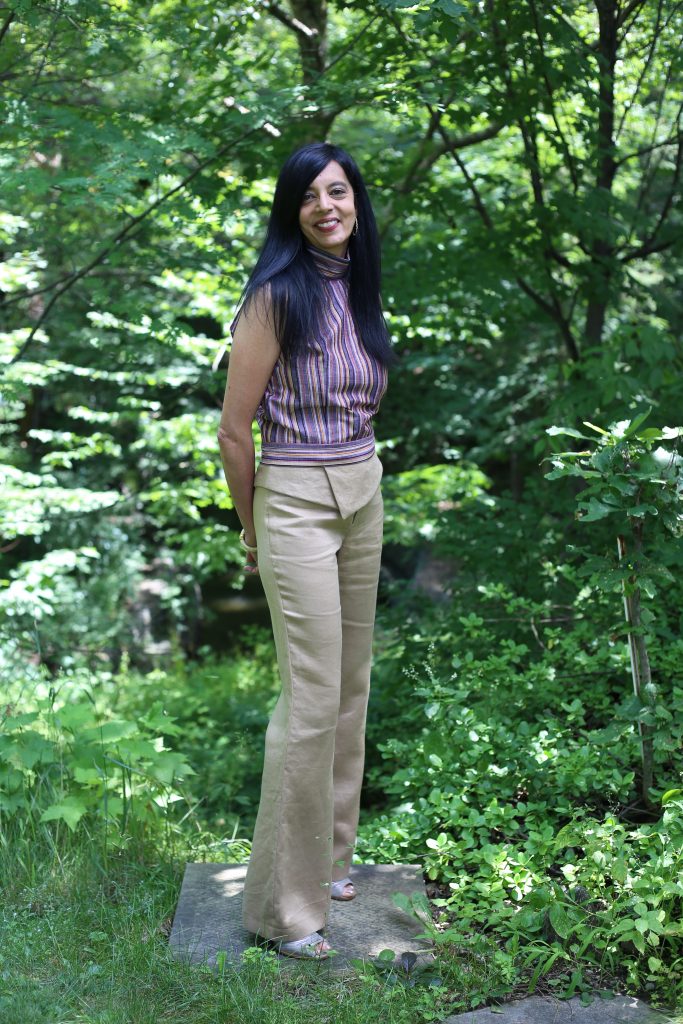
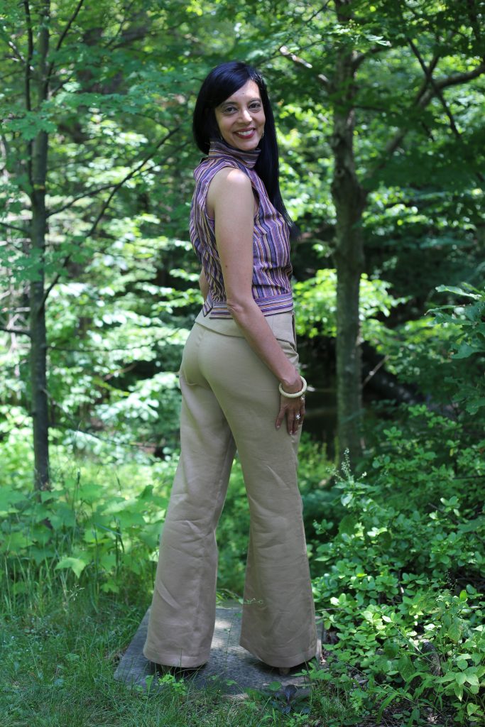
TANK TOP AND WIDE LEG PANTS: As I mentioned previously, I ended up swapping the tank top with the halter top in the second sketch. I scrapped the sleeves simply due to time. The end result was a halter top in the striped shirting paired with wide-leg pants in khaki linen with a similar foldover waist to the skirt above. This look was by far the crowd favourite (in no small part due to my amazing model!!)
The fifth and final piece for the collection was the little cocktail dress. I did it in a “tent” style, but since I used such a thin drapey fabric it didn’t stand out from the body at all. I have to say, this was my least favourite piece to make. A dress like this needs to be draped, not flat-patterned, and I have zero experience with draping. I really winged it, and while it doesn’t look that bad, I know it isn’t exactly what I was trying to achieve. Stick to tailoring, Anokhee!
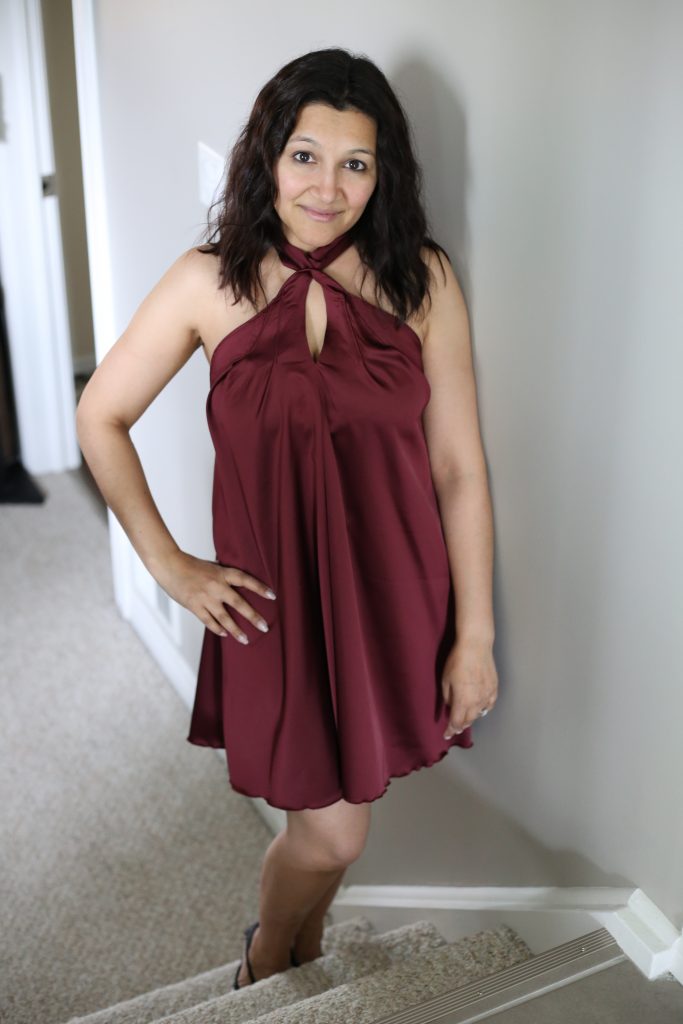
The fashion show was really incredible. It was such a rush to see my girls lined up in their outfits and to hear my song choice playing (“Good Life” by OneRepublic) as they walked out. I was excited to see the photos and videos – there were two pro photographers at the show and a pro videographer – so I didn’t bother taking many of my own. I don’t know what happened, but I do know they were there as volunteers and were not being paid, so perhaps that is why we got the outcome we did. Which is: I have yet to see the video. One of the photographers never sent shots. The other one did, but the photos were absolutely horrible. Sigh, and lesson learned. So – here are a few shots of the show that were taken by my fiance. I will be better prepared next time!!
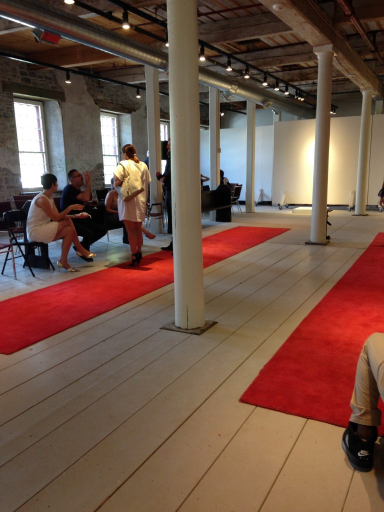
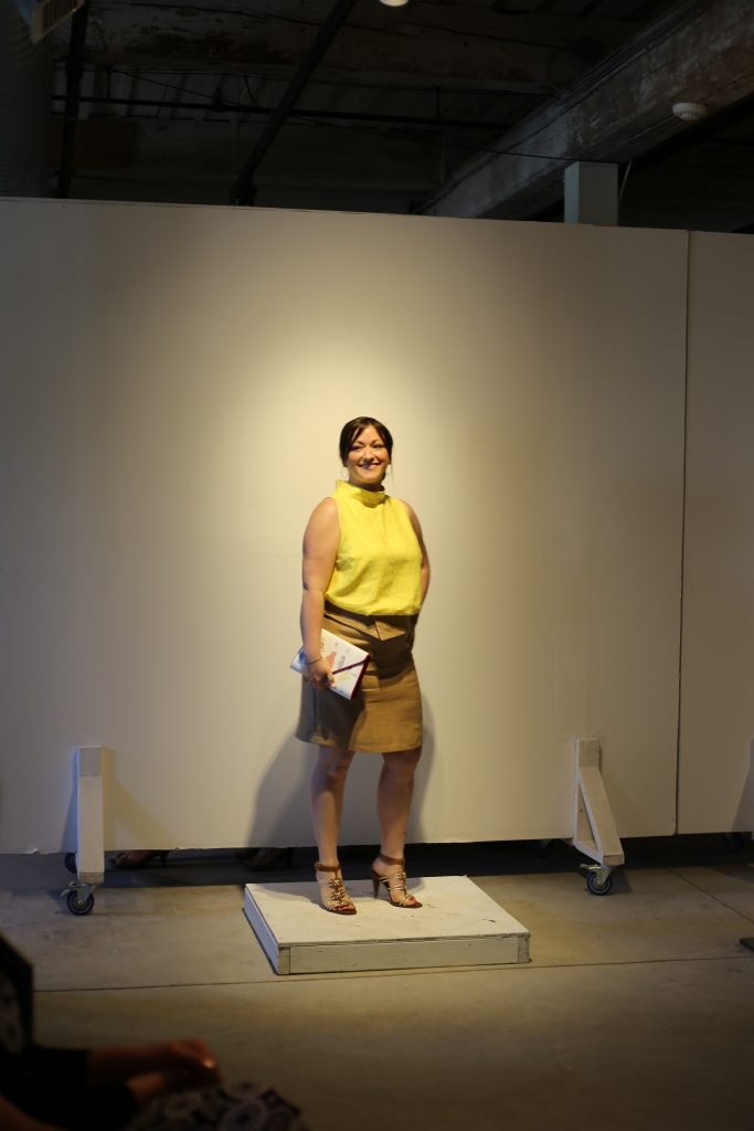
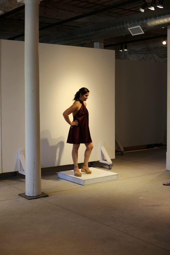
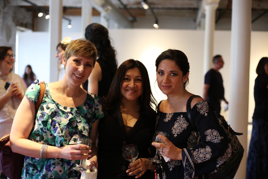
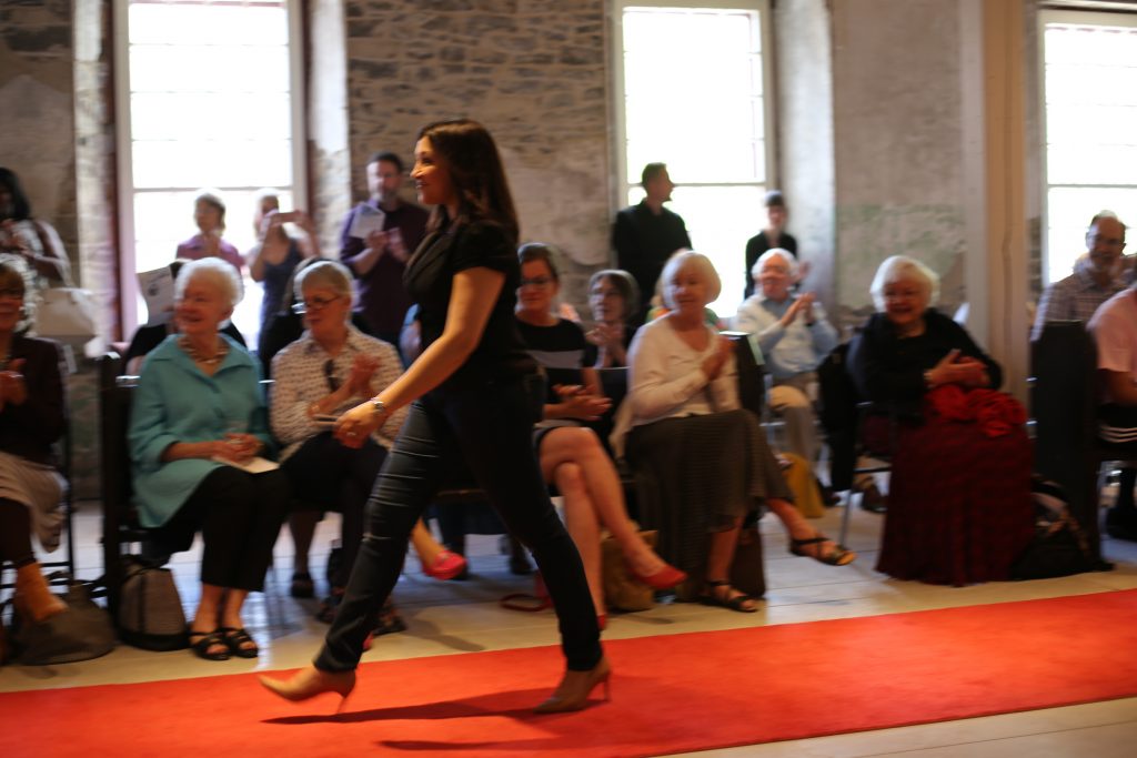
I know that only gives a small glimpse into what really happened, but I promise you it was amazing. I’m seriously considering doing another fashion show in the fall of 2018. I’ll post details as the time comes and I hope you will all be there to support me!!
Have any of you designed your own collection or shown in a fashion show? I’d love to hear your tips and lessons learned!
